One way of drawing the weather
Every weather map on Forecast City, from a radar loop to a storm total, is drawn in one theme. The ground comes from the atlas, the colors are built so equal steps look equal, and the words use the site’s three typefaces. A Blend forecast and an MRMS radar mosaic should look like pages from the same book.
A light ground
Cream paper, never a black screen. Weather is drawn over the land and under the words, so the places always stay readable.
Equal steps look equal
Scales are blended in OKLab, a color space matched to how eyes judge lightness, so ten degrees looks like ten degrees anywhere on the scale.
Words, not codes
“Wednesday, 2 PM,” not “f054” or “18Z.” Observed and forecast are always labeled, and every map names its source.
The same twelve places
Each city picks a dozen places that appear on every map, with a value wherever the map has one, so two frames compare at a glance.
Anatomy of a map
Temperature, Wednesday 2 PM, as the player draws it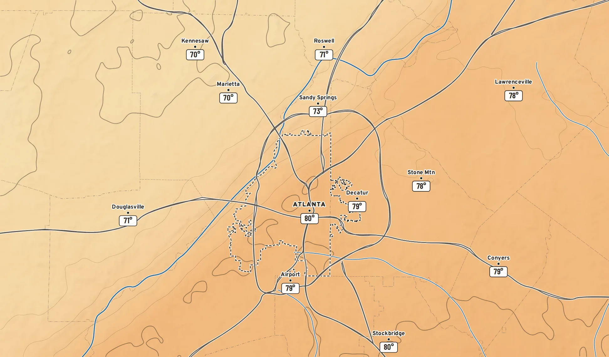
-
1
Title cardWhat, when, and whether it happened. A solid chip means observed; a striped chip means forecast, the same as the timeline beneath the map.
-
2
Source stampEvery map names its source, run and lead time in plain words: “National Blend of Models · 8 AM Monday · 54 hours out.”
-
3
LegendThe scale and its unit, in the corner that covers the fewest places.
-
4
Value pillsBarlow Condensed on white, at the same twelve places on every map that has values to show.
-
5
ContoursTemperature gets a line every 2°, heavier at 60, 70, 80 and 90. Freezing is heaviest of all whenever it appears.
-
6
The groundThe atlas, turned down: rivers in blue, interstates in warm gray, city limits dashed. Weather over the land, under the words.
The color scales
One-hue scales run light to dark. Two-hue scales meet at a neutral middle. The gray strip under each bar is its lightness alone: if the order survives in gray, it survives for color-blind readers, on paper and on a phone in the sun.
Temperature
Temperature, feels-like, highs and lows. °F.Centered on 60°F, the mild middle, and lightest there. Blues get darker as it gets colder, oranges and reds as it gets hotter. 32°F is drawn as a heavy line.
Warmer or cooler
Change since yesterday, difference from normal, the heat island. °F.Blue cooler, orange warmer, a neutral gray at zero, so “no change” looks like nothing at all.
Dew point
How the air feels. °F.The bands match the comfort meter on every city page: dry, comfortable, sticky, muggy, oppressive.
Wind and gusts
Sustained wind and peak gusts. mph.Light to dark in one blue-violet. Streamlines on top show where the air is going; the color shows how hard it hits.
Radar: rain
Reflectivity from MRMS and the RRFS. dBZ.The one scale that keeps tradition: the greens, yellows, reds and purples people already know, retuned for a light page. The jump to yellow at 40 dBZ marks heavy rain on purpose.
Radar: snow and ice
Where the Blend’s precipitation type says snow, sleet or freezing rain. dBZ.Snow in blues, sleet and freezing rain in pinks, each light to dark, so a winter storm’s rain, ice and snow bands read apart at a glance.
Rain total
Measured and forecast rain over a period. Inches.Evenly spaced steps at the amounts people plan around, so a tenth of an inch gets as much room as the difference between 3 and 4 inches. Nothing under a hundredth is drawn.
Chance
Chance of rain, thunder or snow. Percent.One blue from pale to deep. Under 10% is left clear, so a map of low odds looks mostly empty, which it should.
Two grounds, one projection
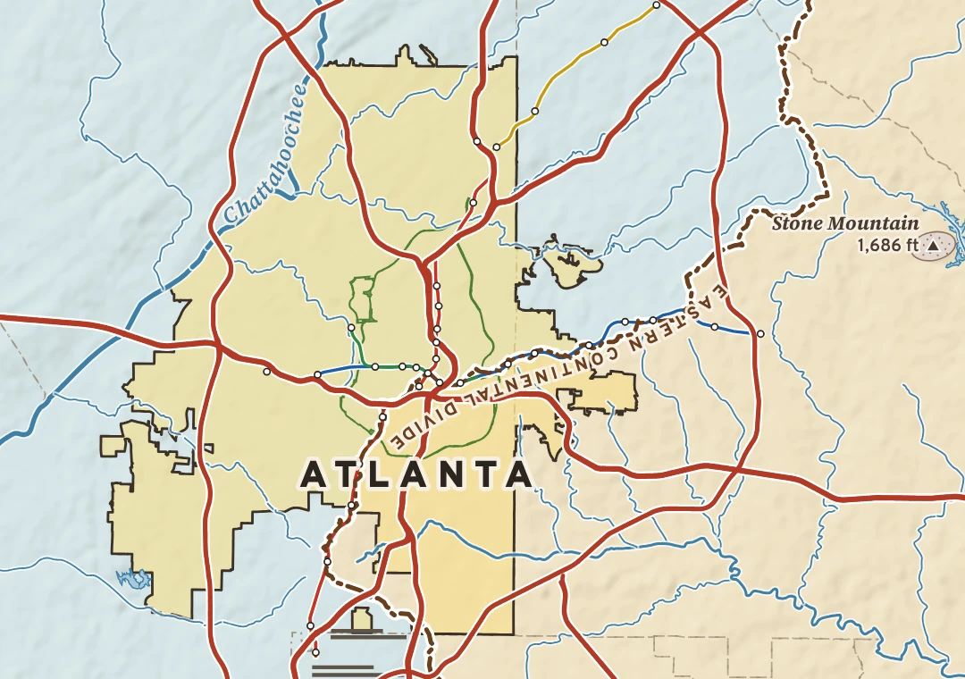
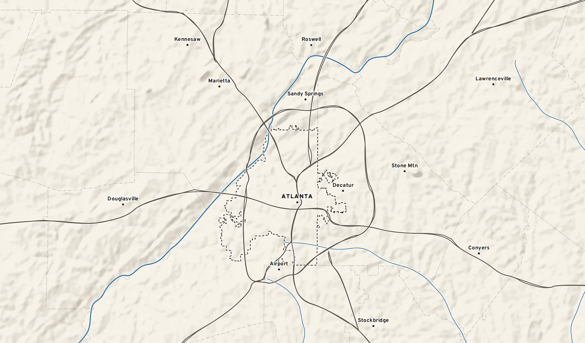
The weather ground is the atlas plate with the volume turned down. Same projection, same scale, same roads and rivers, so any weather map lines up exactly with the city’s plate.
Three typefaces, three jobs
What’s in, and what isn’t
Four layers, chosen because each answers a question people actually ask: is it raining, what should I wear, will the wind knock things over, how much rain fell or will fall. Plus one map a day picked for the story it tells.
- Upper-air charts: 500 mb heights and vorticity, jet streams
- Instability and shear: CAPE, helicity, lapse rates
- Soundings and hodographs
- Model against model: RRFS, HRRR, GFS, ECMWF
- Ensemble spread, plumes and probabilities
- Every NBM and NDFD element, at every percentile